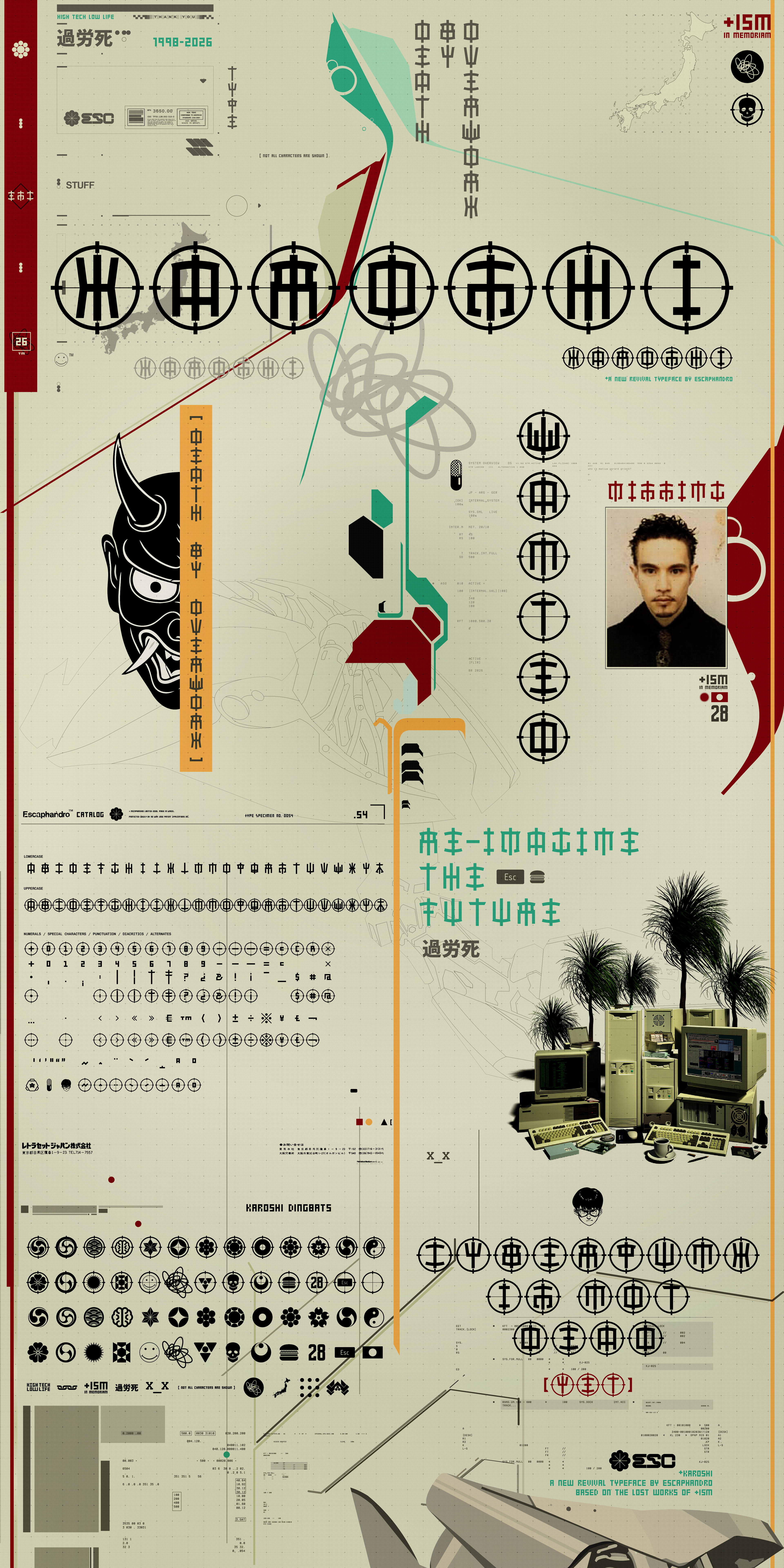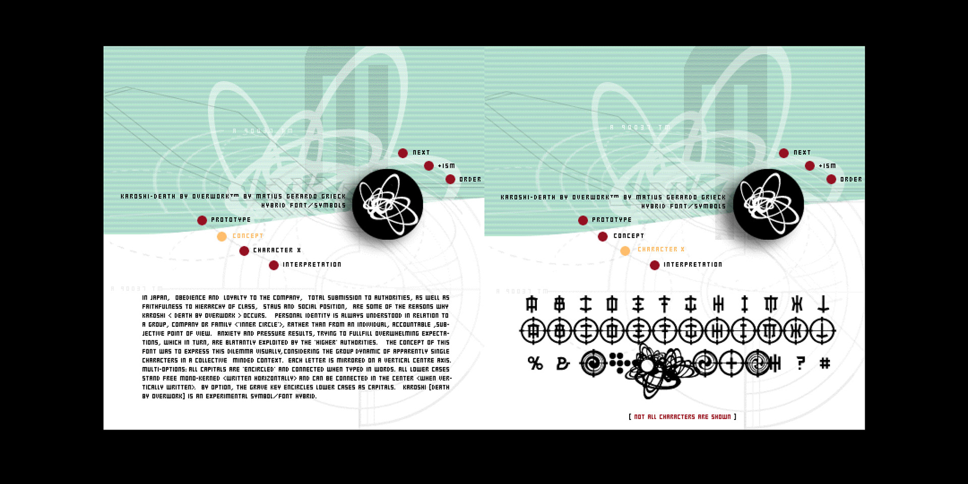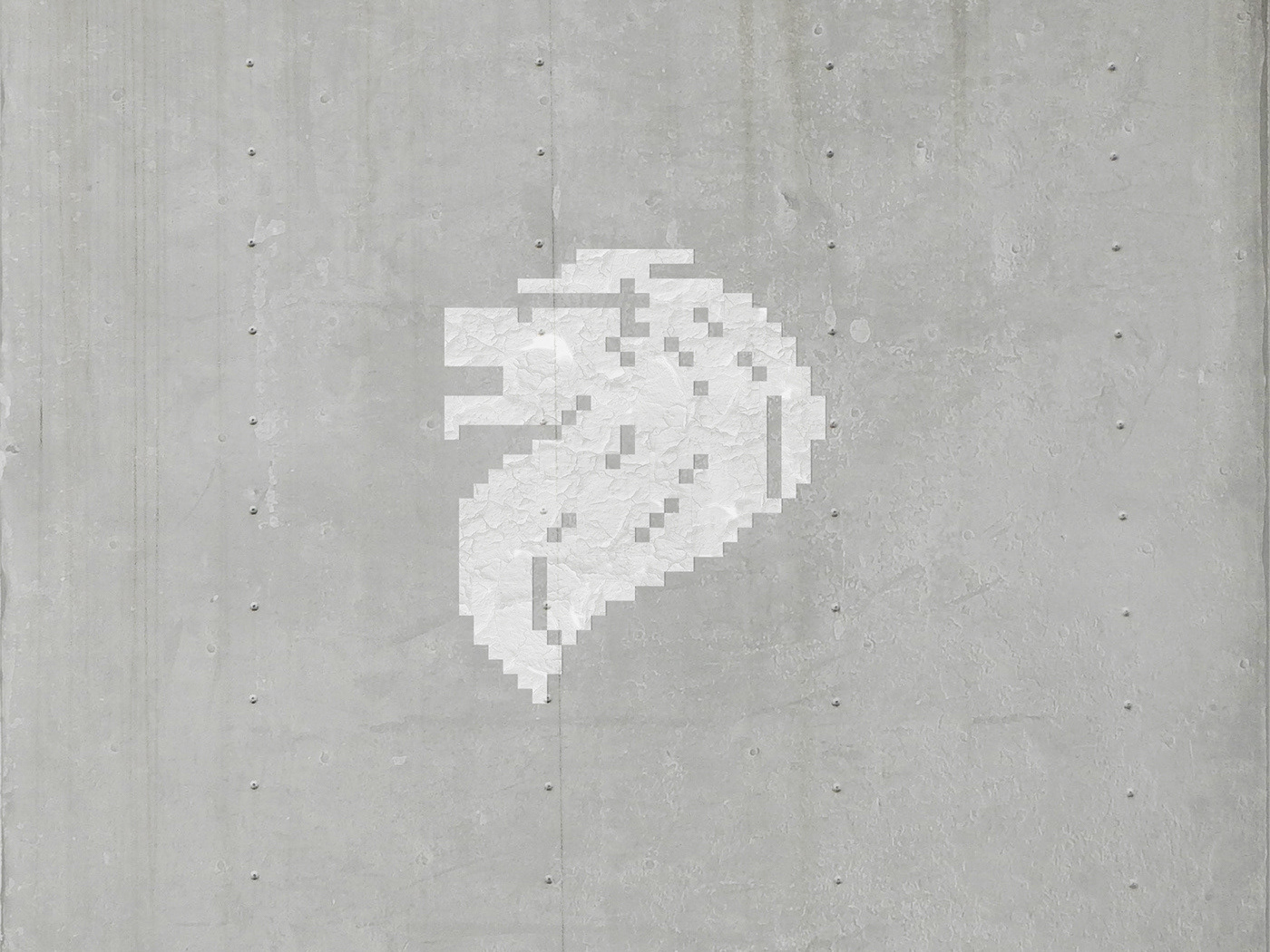
The KAROSHI journey began almost 30 years ago, rooted in admiration for the work of German/Argentinian designer Matius Gerardo Grieck, aka +ISM. His graphic and type design left a clear mark in the early days of digital type.
That era favored bold concepts and format experiments—an intense, inspiring landscape later flattened by social media and template-based design. KAROSHI draws from Japanese culture and the unsettling idea of “death by overwork” (not nostalgic at all). The project started from a rescued folder of references from 1998/1999, when standard formats barely existed and early WWW experiments like +ISM’s ran wild.
That era favored bold concepts and format experiments—an intense, inspiring landscape later flattened by social media and template-based design. KAROSHI draws from Japanese culture and the unsettling idea of “death by overwork” (not nostalgic at all). The project started from a rescued folder of references from 1998/1999, when standard formats barely existed and early WWW experiments like +ISM’s ran wild.
With little to no recent information available about the designer or his fonts, further research reached a dead end. Learning KAROSHI was not commercially available set off an unusual question: how do you revive an already digital typeface? Rather than follow a traditional revival path, this work honors an early influence by updating an experiment into a full contemporary typeface.
Starting from only a few letters and low-res images, KAROSHI became a personal project shaped by cyberpunk references and expanded into a larger, functional character set. A complementary dingbat font followed, sparked by research that proved genuinely fun. Recommended for type and lettering experiments, techno-flared logos, and cyber titling—Y2K aesthetics in all its glory.
Available at You Work for Them and Pixel Surplus