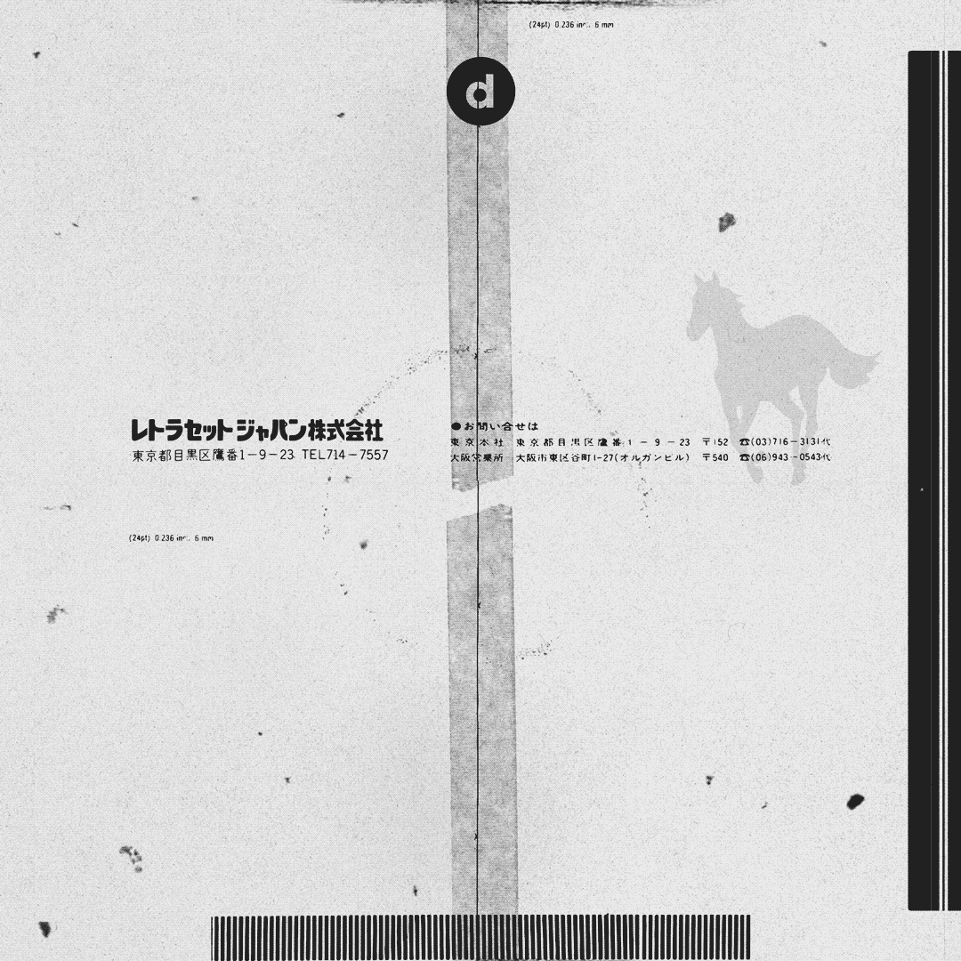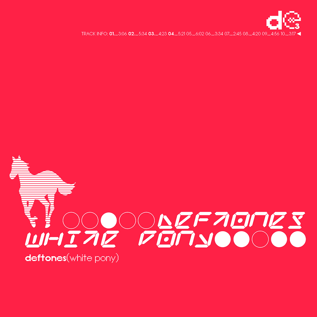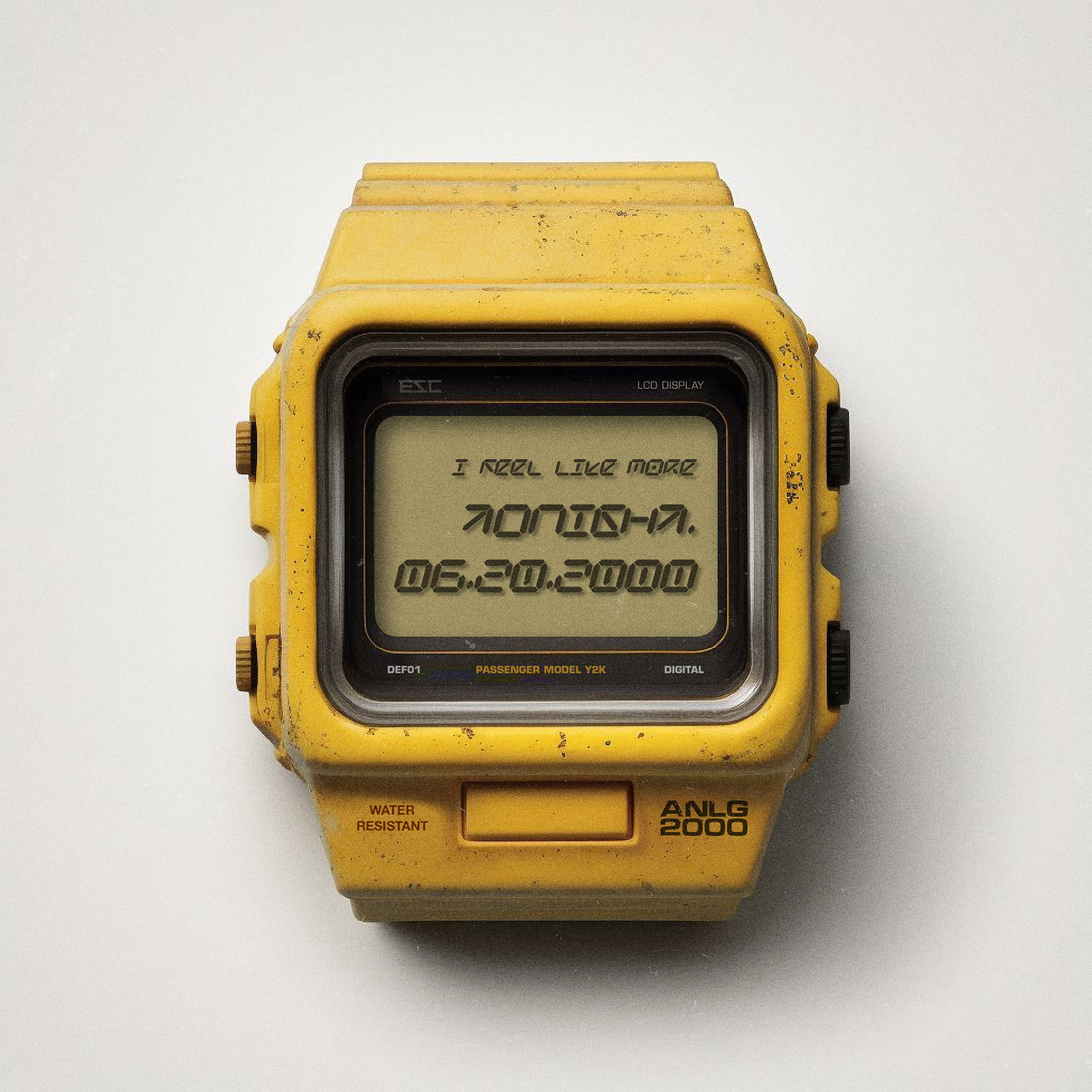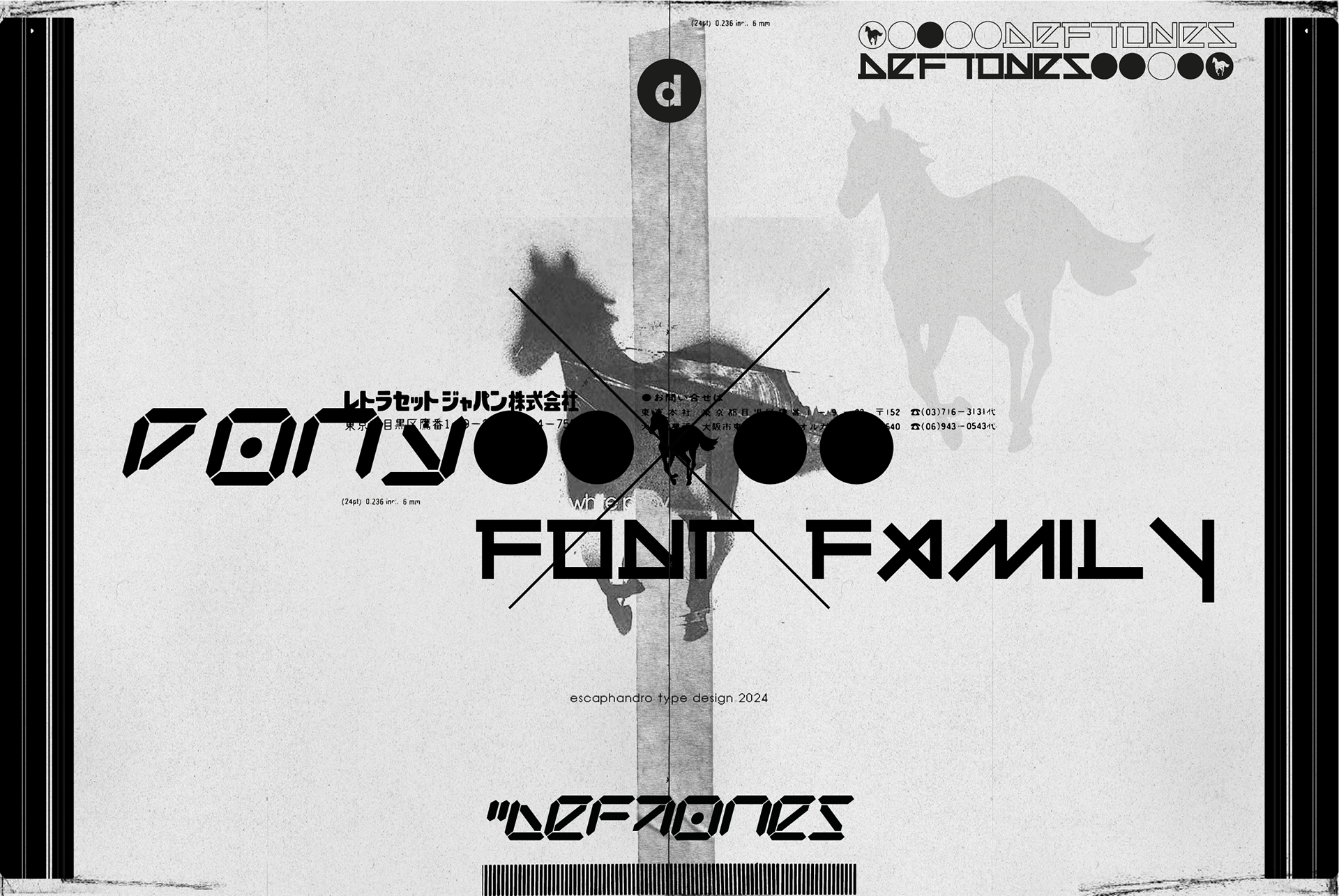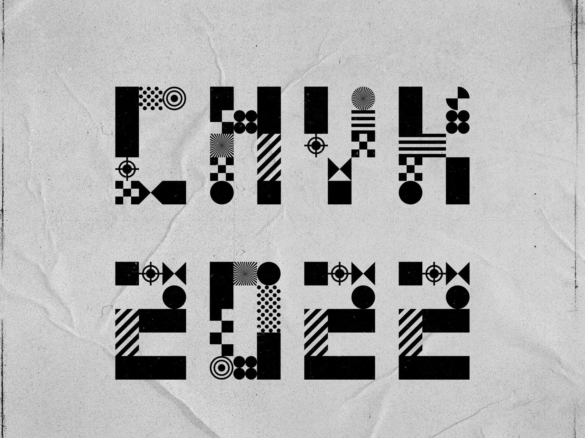
This one's been cooking for a while now (about 20+ years), as Pony Regular is one of my first type designs, beginning in 2001. More than a music fan tribute to the Deftones' masterpiece album "White Pony", this type collection is a homage to the visual side and enduring influence of the band's aesthetics, a really inspiring creative partnership with art director Frank Maddocks that (truth be told) still resonates with me after all these years.
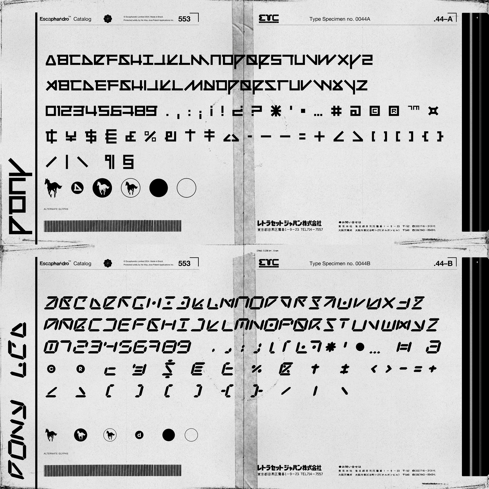
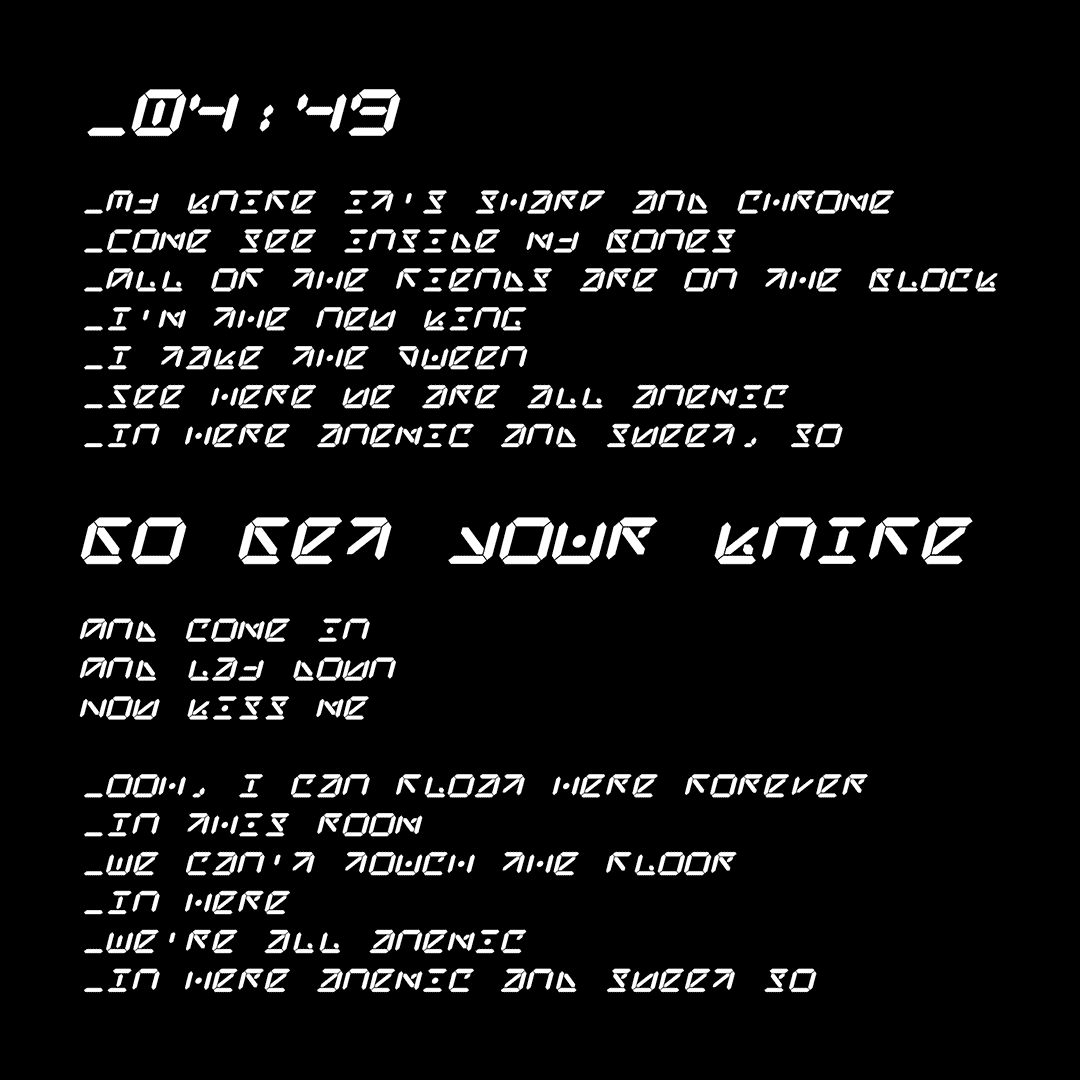
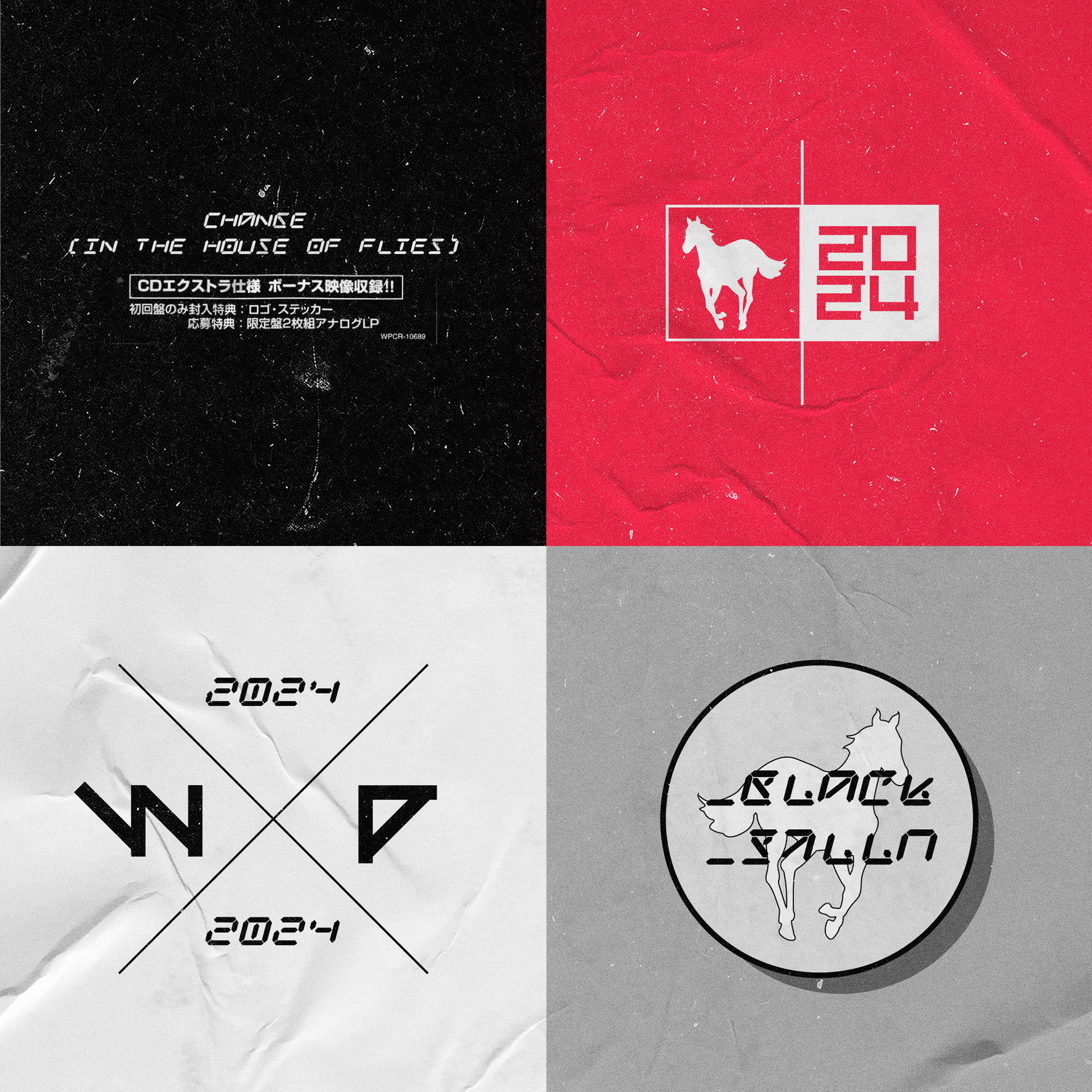
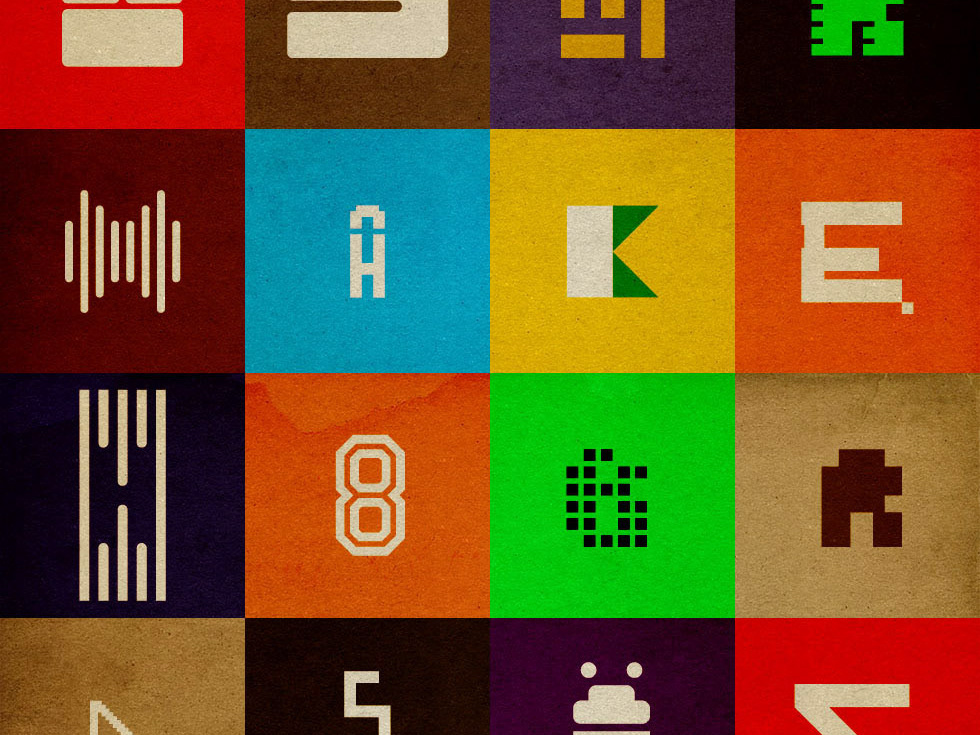
Cut from 2 band logos designed for the album, Pony Regular and Pony LCD are the kind of attempt that seem very logical, yet challenging, to fill the gaps and build a functional character set from a few uppercase letters. The PX (pixel) version is a bonus, designed from the same structure of the regular weight.
The combination of analog collage and ambient graphics, along with a y2k lush polish really matches the music and proved to be a timeless classic. It was really fun to translate that into the full typefaces presented here.
As this is a very personal work, I am providing a free for personal use license for those who are interested.
Rock on.