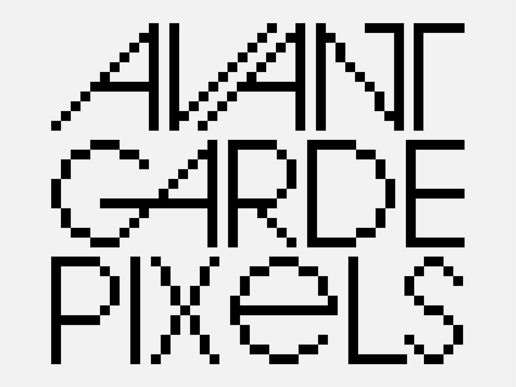
A exercise in curiosity that became a new design, ZEBRA is based on an 1970 logotype designed by the great Herb Lubalin (Avant Garde, ITC, etc.). When I read the description below, it only made more sense to develop it in the form a full typeface:
“Logo for Zebra Associates, the first US advertising agency formed by African-American and white American owners. The letterforms alternate between black and white, and function on either a black or white background, signifying the agency’s dual-race ownership.”
The hard geometric structure of the logo made the challenge even more appealing to me, given my affinity with Fontstruct, the result is 100% "fontstructed".
The experimental and graphic nature of Zebra is better displayed in large sizes and logo designs, alternating its 2 variants. Contains basic latin diacritics and ZERO letterspacing.
Available on YWFT and Pixel Surplus

